
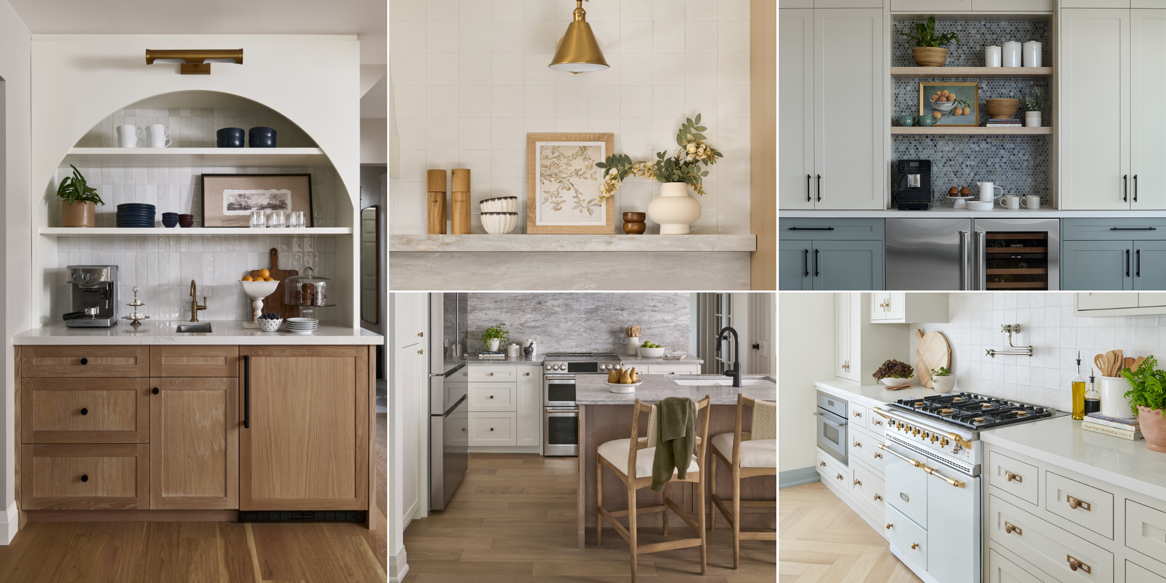
Five Kitchens We Love: A Look Inside Our Recent Renovations
The kitchen is almost always where a home renovation starts. It’s where families gather, where mornings begin, and where entertaining happens, sometimes all at once. It’s also one of the most personal spaces in a home, because no two families use their kitchen the same way.
Over the past year, we’ve had the privilege of designing several kitchens that each tell a very different story. Different layouts. Different lifestyles. Different visions. And yet each one ended up feeling exactly right for the people who live in it.
Here’s a look inside five of our favourite recent kitchen renovations.
Project Edgewater
As seen in Style at Home
Project Edgewater brought us to a beautiful bungalow on the east side of Toronto, overlooking Lake Ontario. The clients came to us ready for a full main floor renovation. Not just a kitchen update, but a complete reimagining of how the space could function and feel.
Working closely with Lyons Construction, we rebuilt the main floor from the ground up. The brief was clear: create something cozy, functional, and personal. A neutral palette with texture and warmth, designed around the way this couple actually lives in their home.
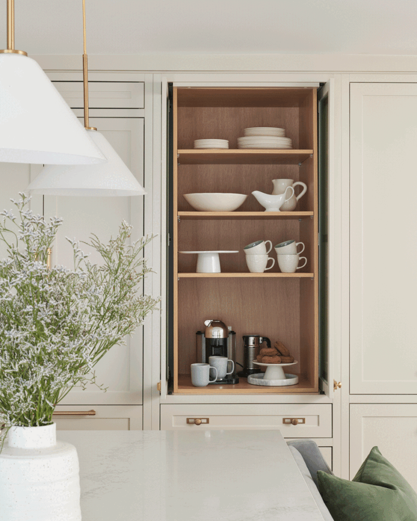
The kitchen and connected coffee and drink bar became the heart of the main floor. Rather than treating the bar as an afterthought, we designed it as a true extension of the kitchen, directly connected to the dining area and thoughtfully laid out for both the morning routine and evening entertaining. It’s one of those features that, once you have it, you can’t imagine living without.
Two paint colours anchor the cabinetry by Olympic Kitchens: Edgecomb Grey by Benjamin Moore on the perimeter and Duxbury Gray, also by Benjamin Moore, on the island and coffee bar. It’s a subtle tonal shift that reads as intentional without drawing attention to itself. The result is a kitchen with quiet depth and a layered, considered feel.
This project was featured in Style at Home, a recognition that felt right for a space this carefully crafted.
Project Roanoke
With a family of five, several pets, and a life that includes school runs, kids’ activities, working from home, regular entertaining, and a genuine love of baking and cooking, the wish list for the kitchen at Project Roanoke was long. And every item on it was non-negotiable.
The original layout simply couldn’t deliver. The kitchen was smaller than the family needed, connected to a dining room that wasn’t pulling its weight, and missing dedicated spaces for the way this household actually functions. To get where the clients needed to be, we had to rethink the floor plan entirely.
We borrowed square footage from the underused dining room and redistributed it where it was needed most. The kitchen grew significantly, gaining a large island with seating, integrated dining, and room for all the cooking and baking that happens here daily. The remaining space from the original dining room became a small home office at the front of the house, which the family had never had before. A mudroom was also incorporated into the new layout, another space that simply hadn’t existed and that a busy family of five absolutely needed.
The design itself reflects both the warmth and the energy of this home. Wood and painted cabinetry in Simply White by Benjamin Moore are layered together for a look that feels current without being cold. Black and gold hardware runs throughout, a mix of metals that adds sophistication while remaining thoroughly livable.
The baking zone is one of the features we’re most proud of. Dedicated counter space, thoughtful storage, and everything the client needs within reach. It was designed to make the thing she loves doing feel easy and enjoyable, not like a production. The large island anchors the kitchen and works equally hard: it’s where homework gets done, where guests gather, and where the family lands at the end of the day.
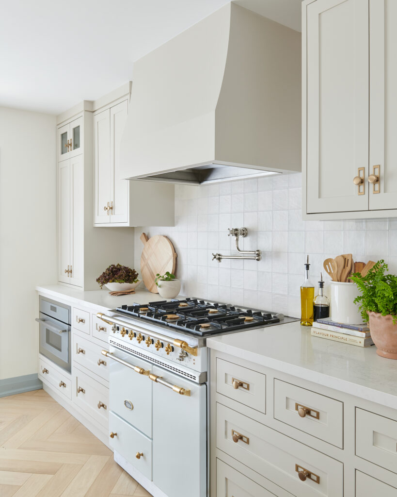
Project Rougemount
This bungalow came to us needing work on every level, both aesthetically and functionally. The client’s vision was clear: a space that felt new and fresh, but with soul. She wanted a blend of antique pieces and old world charm woven into a home that worked beautifully for everyday life.
To get there, we started from scratch. The interior was fully gutted and rebuilt according to our plans. One of the most impactful early decisions was moving the staircase to the back of the home. That change unlocked a generous open-concept flow between the family room, dining area, and kitchen, and transformed how the entire main level lived.
The kitchen itself was a study in what good design can do in a compact space. Face-frame cabinetry, a traditional construction method with visible frames around each door, was chosen deliberately adding depth, craftsmanship, and personality in a way that flat-front cabinetry simply can’t. Finished in Edgecomb Grey by Benjamin Moore for added warmth, cabinetry details like these do a lot of heavy lifting in smaller kitchens like this one.
The cabinet hardware carries that old world thread through beautifully. A brushed gold finish in a classic style that feels at home alongside the face-frame cabinetry without ever feeling costumey.
The anchor of the entire kitchen is the range, a statement piece from Lacanche, the premium French manufacturer known for producing ranges that are as beautiful as they are functional. It was the very first item selected for this kitchen, and in many ways it set the tone for everything that followed. The warm tones, the craftsmanship, the sense that this is a kitchen built for someone who takes cooking seriously: all of it flows from that single decision.
Herringbone hardwood flooring runs throughout the open-concept main level, grounding the kitchen in warmth and tying it visually to the dining and living spaces. The result is a kitchen that feels eclectic, layered, and entirely intentional.
Project Sinatra
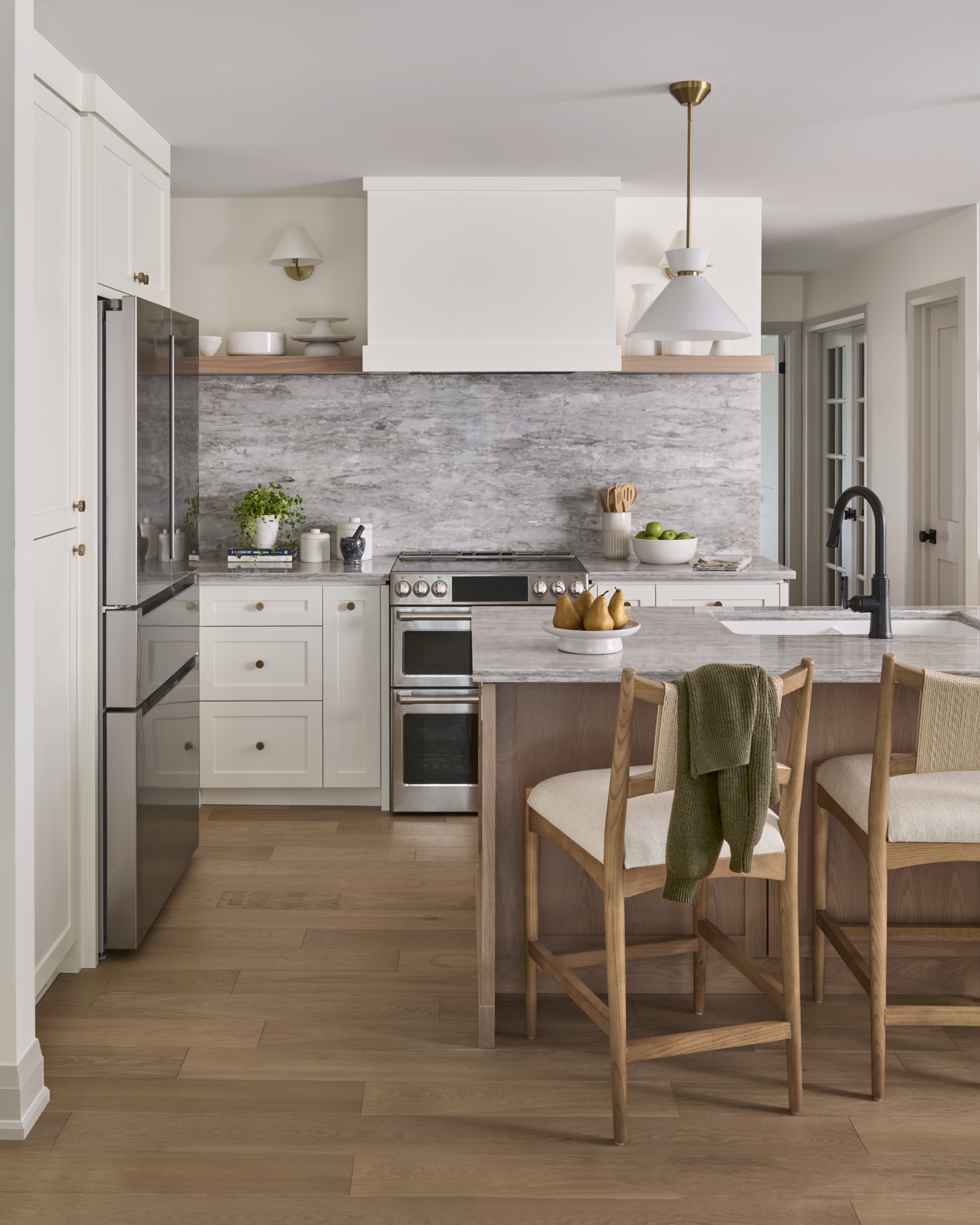
When this couple left Toronto for the suburbs, they weren’t looking for a new build. They wanted an older home with good bones, something they could renovate thoughtfully and make entirely their own. Their brief to us was clear: timeless character, smart functionality, and a small home that felt intentionally designed rather than just updated.
The biggest challenge was the original layout. Tight rooms, awkward flow, and a staircase positioned in a way that was quietly stealing square footage from every room around it. Our solution was to relocate the staircase off the side entry, a structural decision that had an outsized impact on the rest of the main floor. That single move freed up enough space to completely reimagine the kitchen, dining, and family room arrangement.
The result is an open-concept main floor that feels connected and calm. And at the heart of it is a kitchen that punches well above its size.
The defining detail is the arched cabinetry, a soft architectural moment that gives this kitchen its character. In a smaller space, one well-considered feature like this does more than a dozen finishes ever could. Paired with a mix of wood and painted cabinetry in Simply White by Benjamin Moore, the overall feel is warm, classic, and completely intentional.
We’ve written about Project Sinatra in more depth on the blog, but in the context of this roundup, it earns its place as a reminder that square footage has very little to do with how well a kitchen can live.
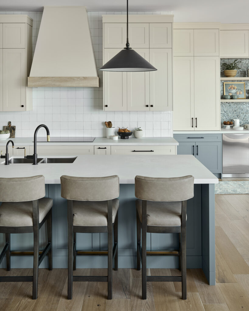
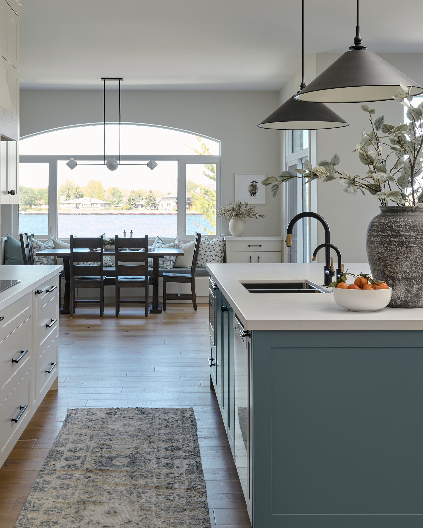
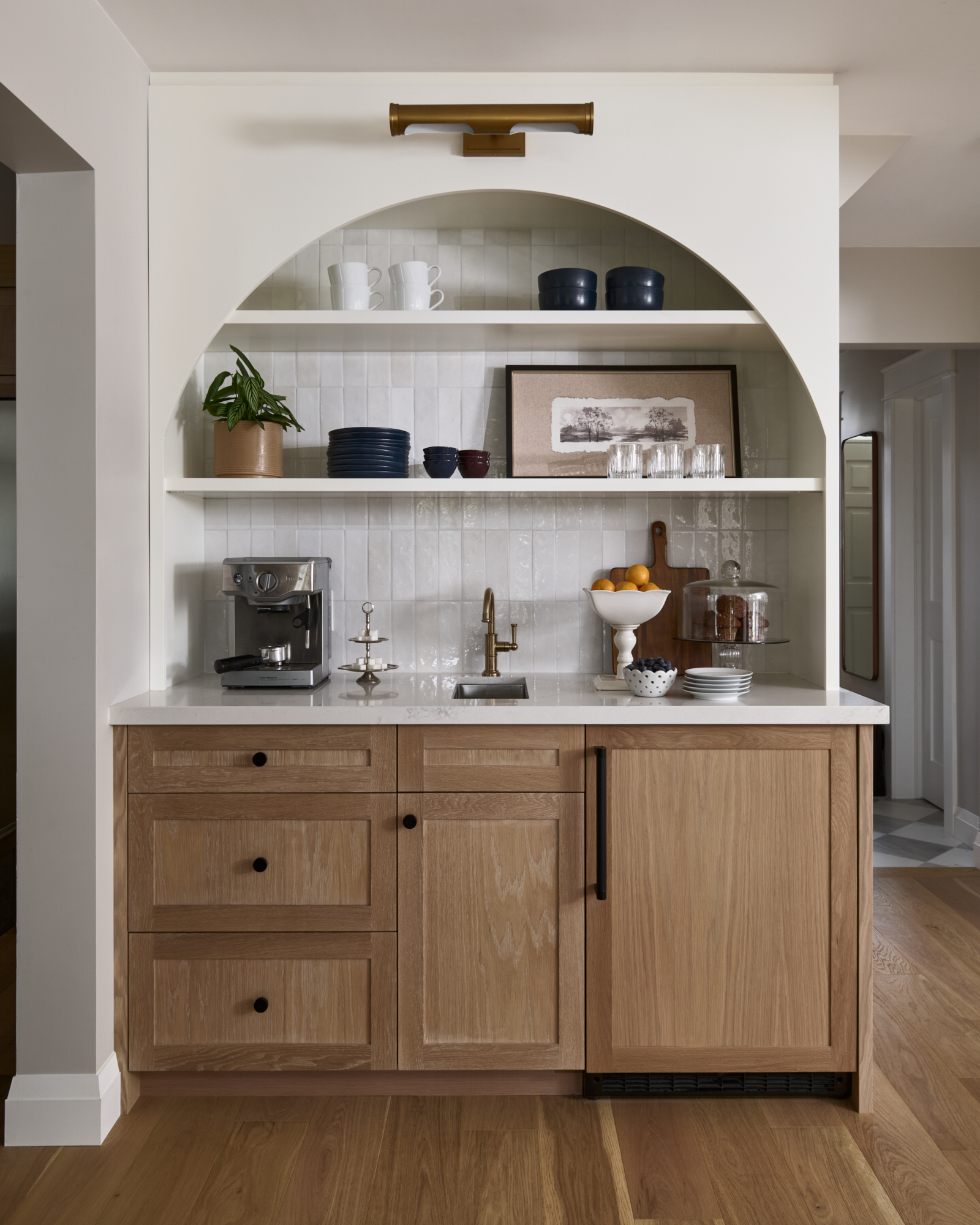
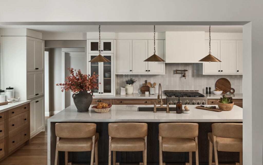
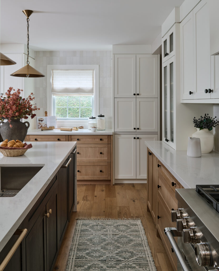
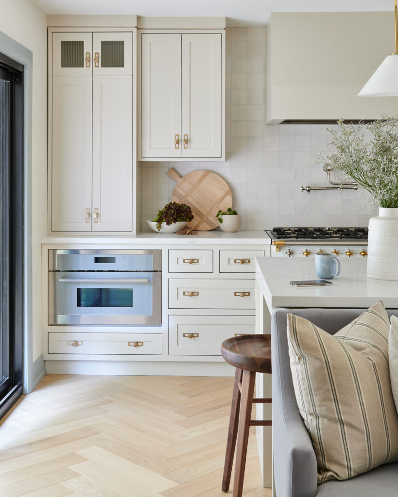
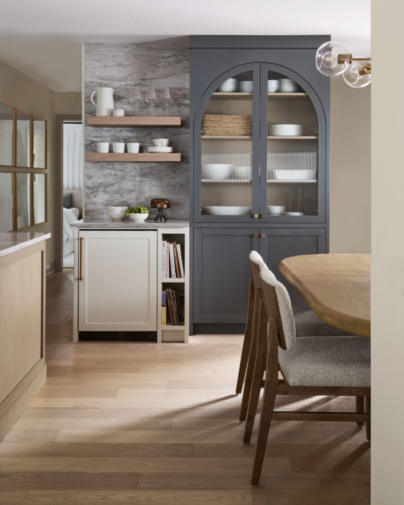
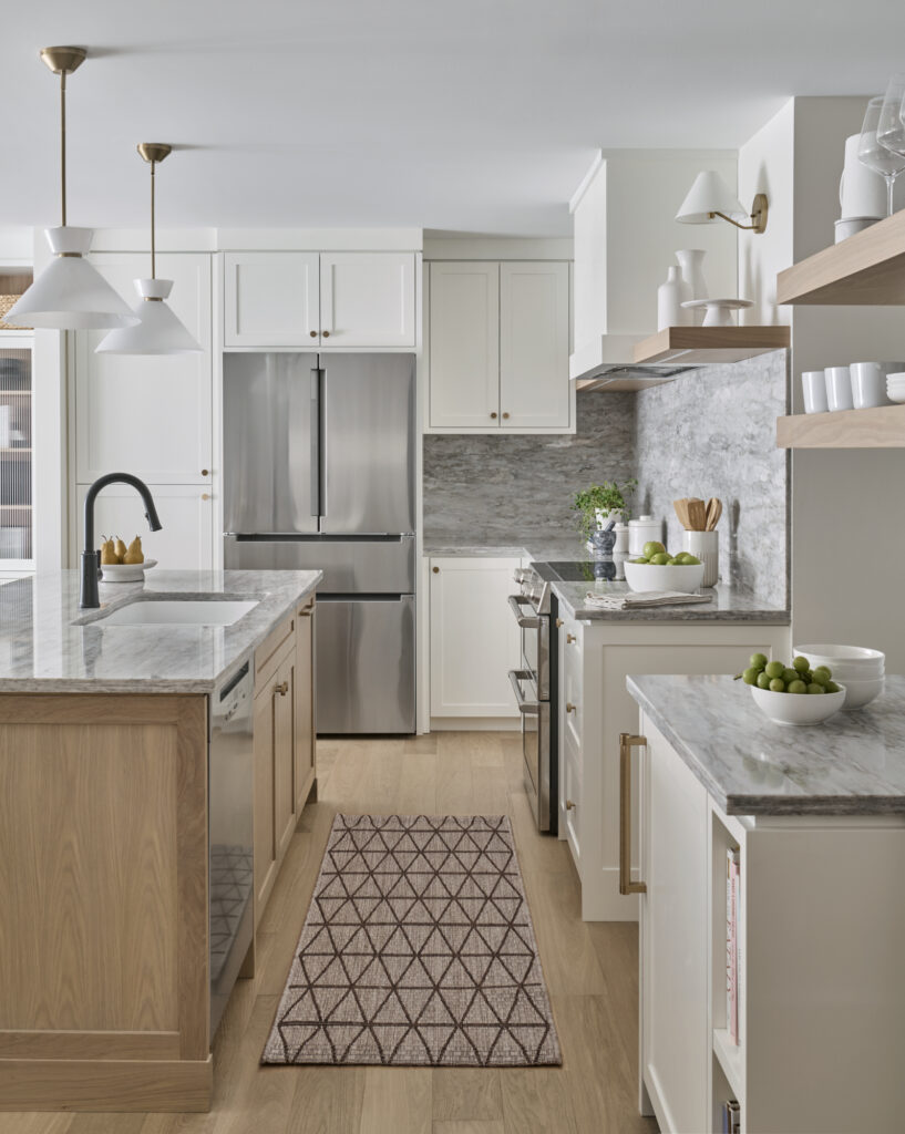
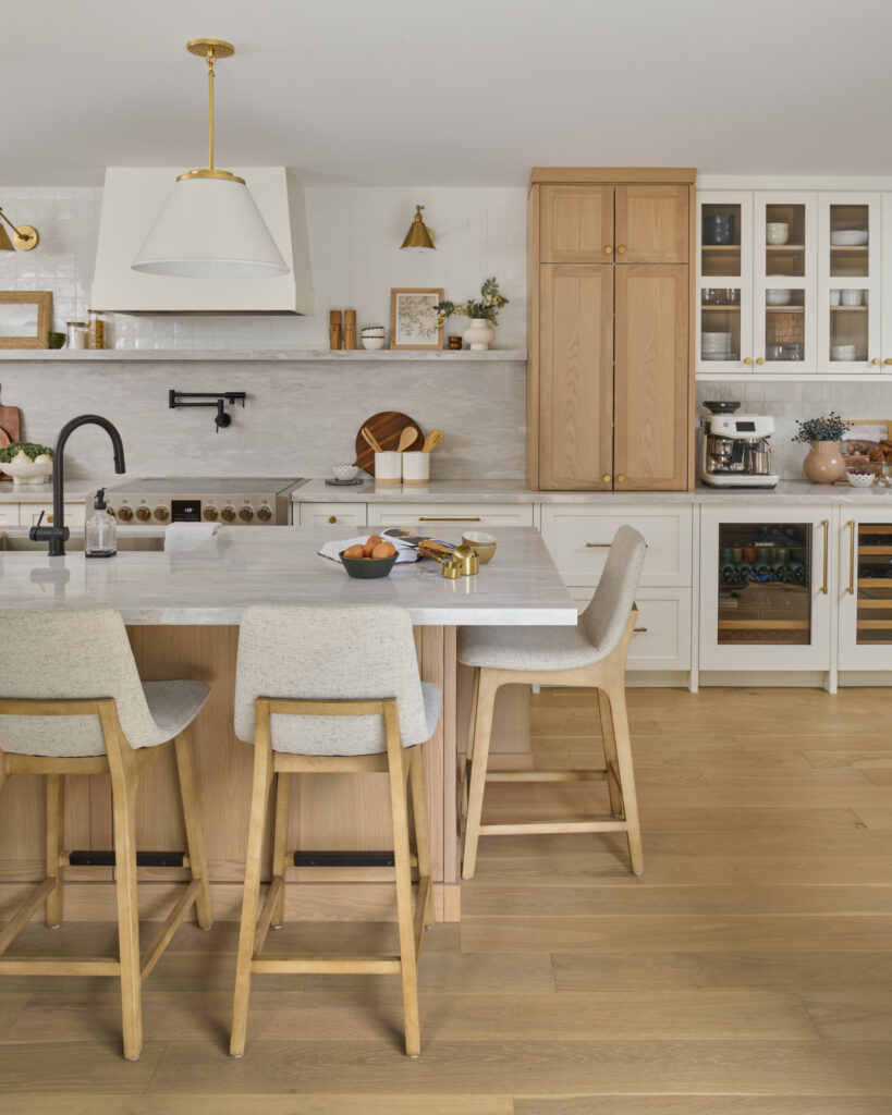
Project Claremont
The clients came to us with a main floor bungalow renovation and a specific challenge: the kitchen felt disconnected from the living areas around it, despite the fact that the floor plan was almost entirely open concept. Long and narrow, the original kitchen didn’t reach far enough into the space to draw the rooms together the way the family needed it to.
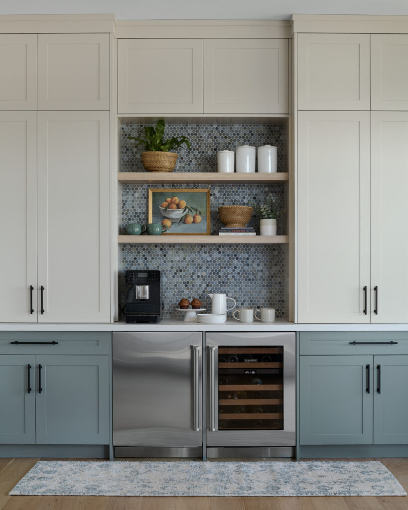
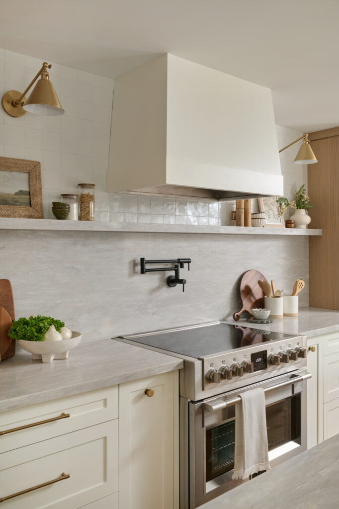
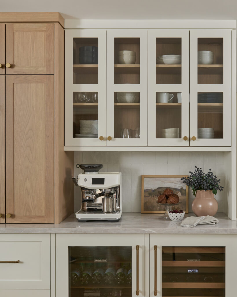
Our solution was to extend the kitchen and add a coffee bar, a move that physically and visually bridged the kitchen to the rest of the main floor. With very few walls to work with, the design had to rely on zones rather than rooms to create a sense of purpose and separation without sacrificing the openness the clients loved.
Each zone was designed to serve a distinct function while remaining completely cohesive with everything around it. The cooking zone centres on the cooktop, with open shelving directly above for quick access to oils, salts, and everyday essentials, a pot filler, and ample counter space for prep. It’s a setup that makes cooking feel intuitive rather than effortful.
The coffee bar is another zone — fully stocked and functional with beverage fridges, a coffee machine, and easy access to mugs and plates. Everything needed for the morning routine or an afternoon break, without encroaching on the cooking space.
The large island ties everything together. With seating for multiple stools, a sink, a dishwasher, and a built-in garbage pullout, it’s genuinely one of the hardest-working surfaces in the home. Prepping, cleaning up, gathering — the island handles all of it.
Open shelving throughout and the cabinetry painted in Simply White by Benjamin Moore adds airiness and keeps the long, narrow footprint from ever feeling heavy. It’s a kitchen that earns its square footage many times over.
Five Kitchens. One Common Thread.
Looking across these five projects, what strikes us most isn’t the finishes or the paint colours. It’s how different they all are from one another. Each kitchen was designed specifically for the family who lives in it, around their routines, their must-haves, and the way they actually move through their home.
That’s the work we love most: not designing a beautiful kitchen in the abstract, but designing the right kitchen for a specific family, in a specific home, at a specific moment in their lives.
If you’re thinking about a kitchen renovation and you’re not sure where to start, we’d love to hear what you’re working with and what you’re dreaming of. Get in touch here — we’d love to connect.

Be the first to comment